About
Why Redesign?
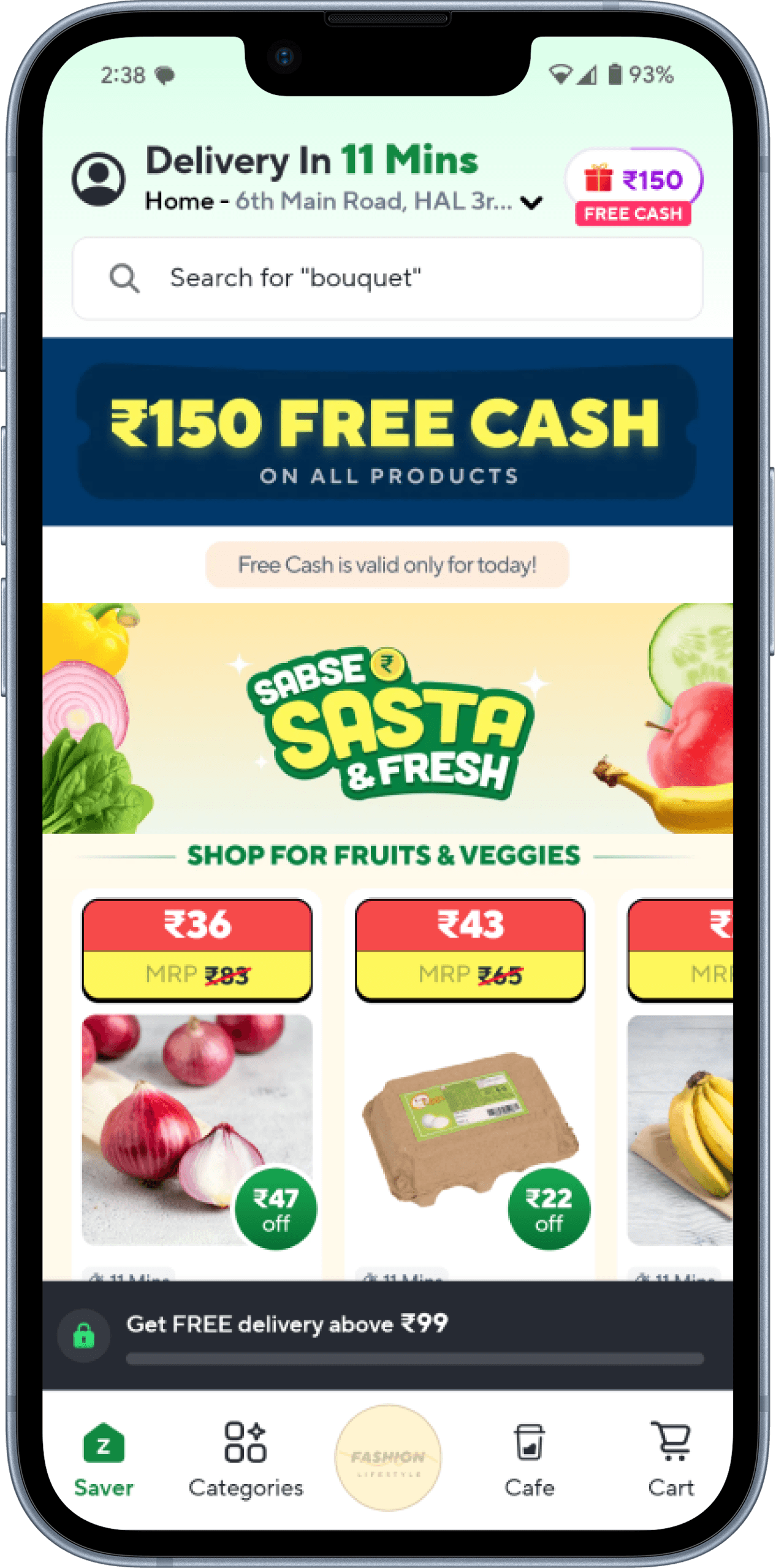
Before

After
Design Process

Empathize
Conducted user interviews to analyze frustrations and behaviors.

Define
Framed problem statements to focus on specific user frustrations.

Ideate
Brainstormed solutions to improve usability.

Prototype
Created high-fidelity UI mockups with final visual designs in Figma.

Test
Conducted usability testing with 10+ users.
User Persona

Rutuja
28
Software Engineer
Bangalore, India
Shopping Habits
✅ Orders groceries 3-4 times a week.
✅ Prefers quick checkout & reordering.
✅ Uses Zepto for last-minute groceries.
Pain Points
🔴 Finds reordering past items difficult.
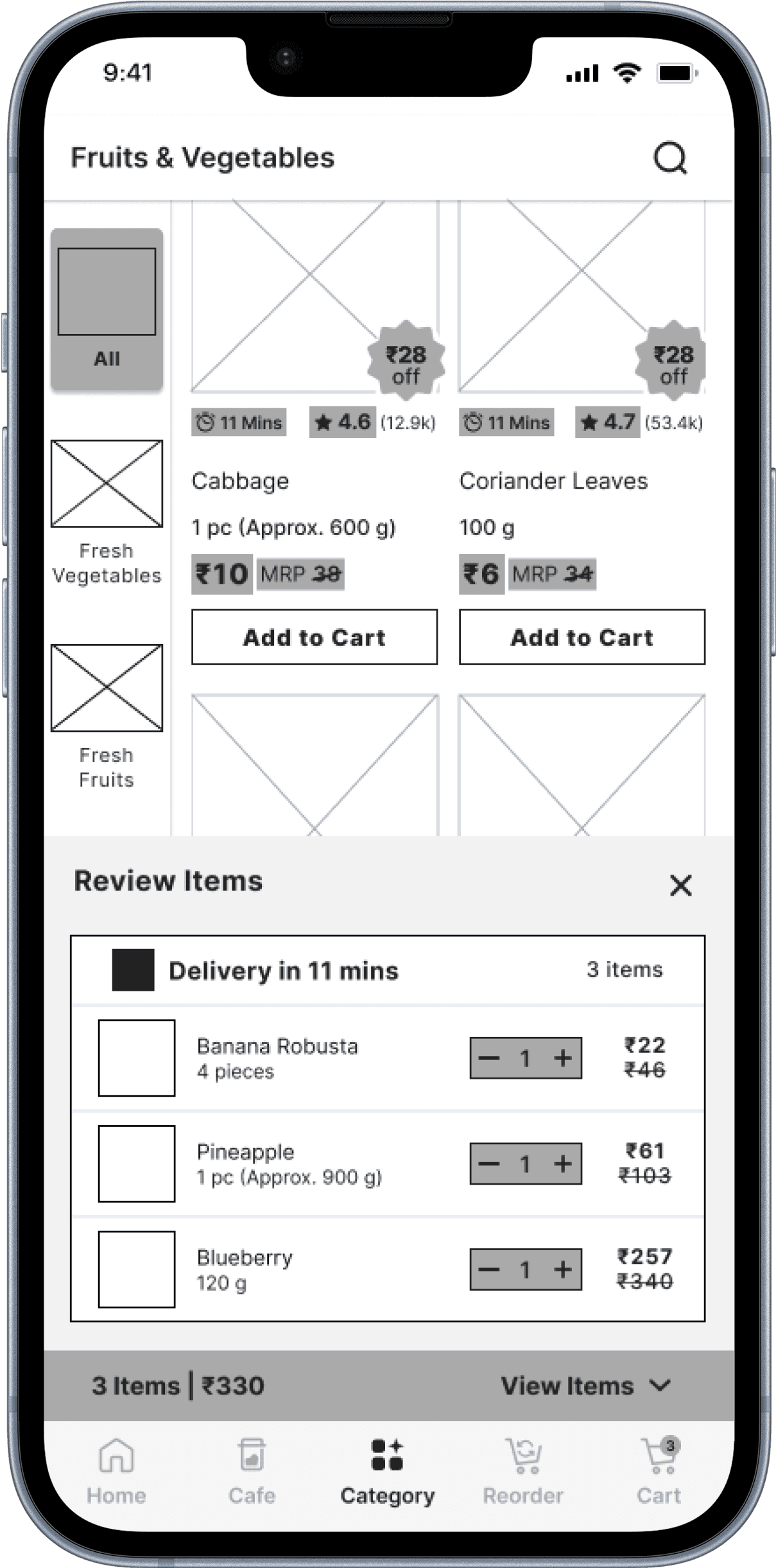
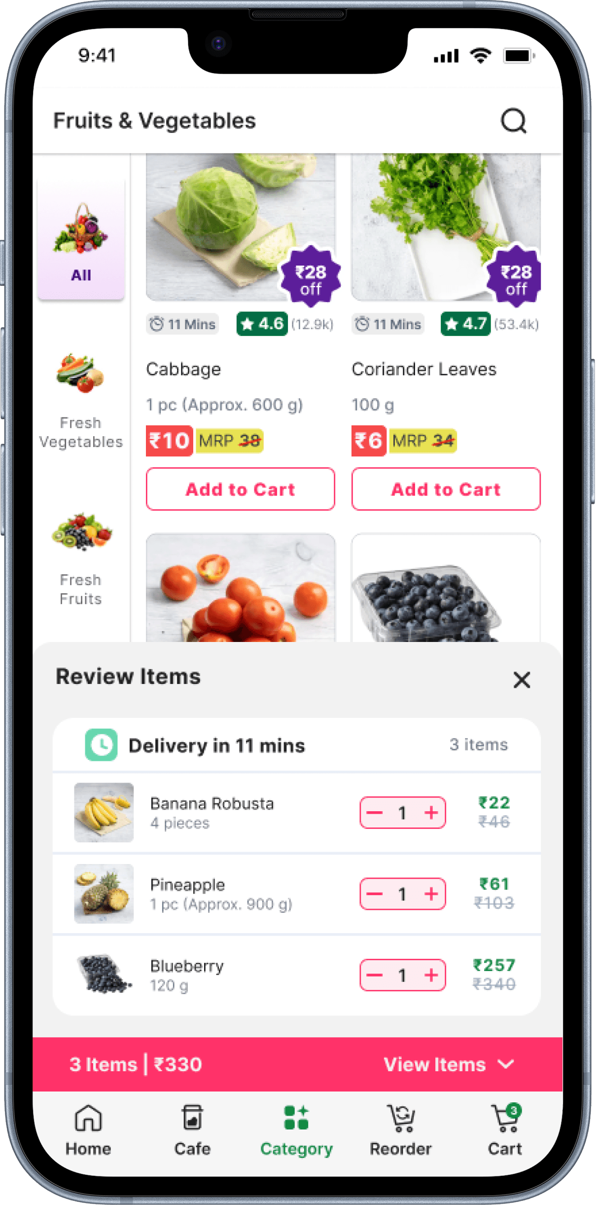
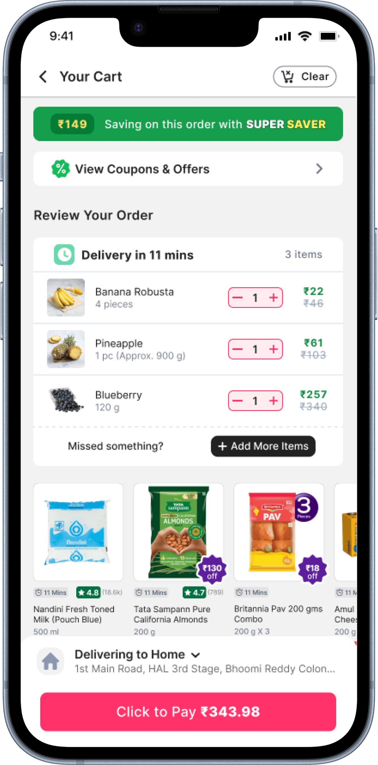
🔴 Struggles to view all selected cart items.
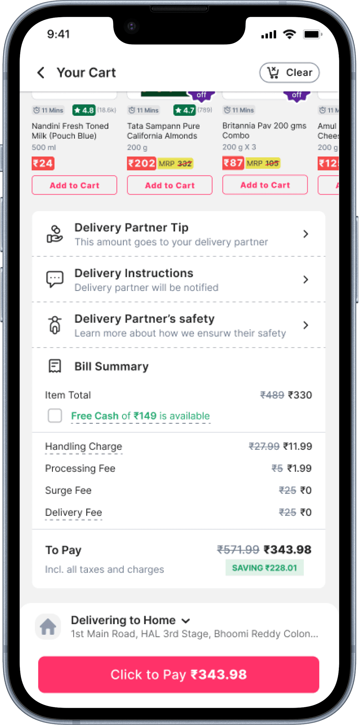
🔴 Confused about bill summary & Free Cash usage.
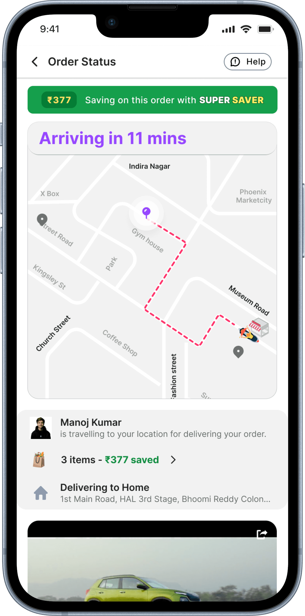
🔴 Wants real-time tracking after placing an order.
Empathy Map
SAYS
“I wish I could reorder quickly without searching again.”
“It’s frustrating that I can’t see my selected items easily.”
“I don’t always understand the final bill breakdown.”
“I want to track my order live like I do with food delivery apps.”
THINKS
“The app should make reordering effortless.”
“I need better visibility into what I’ve added to my cart.”
“Why can’t I use my Free Cash easily during checkout?”
“I hope my order is arriving on time, but I have no way to check.”
DOES
Reorders manually by searching for the same products again.
Clicks multiple times to check items in the cart.
Gets confused about bill breakdown and available payment options.
Calls customer support or waits without updates on order status.
FEELS
Frustrated due to extra steps in the shopping process.
Uncertain about the total cost before payment.
Anxious about order delivery status.
Annoyed when there’s no clear way to track the order.
Problem Statement
How might we simplify the Zepto shopping experience by making reordering faster, improving cart visibility, providing clear bill summaries, and adding real-time tracking?
Challenges
🔴 Users struggle to quickly reorder past purchases.
🔴 Cart visibility is unclear, leading to accidental duplications.
🔴 No direct bill summary with Free Cash usability.
🔴 No live order tracking, causing post-purchase anxiety.
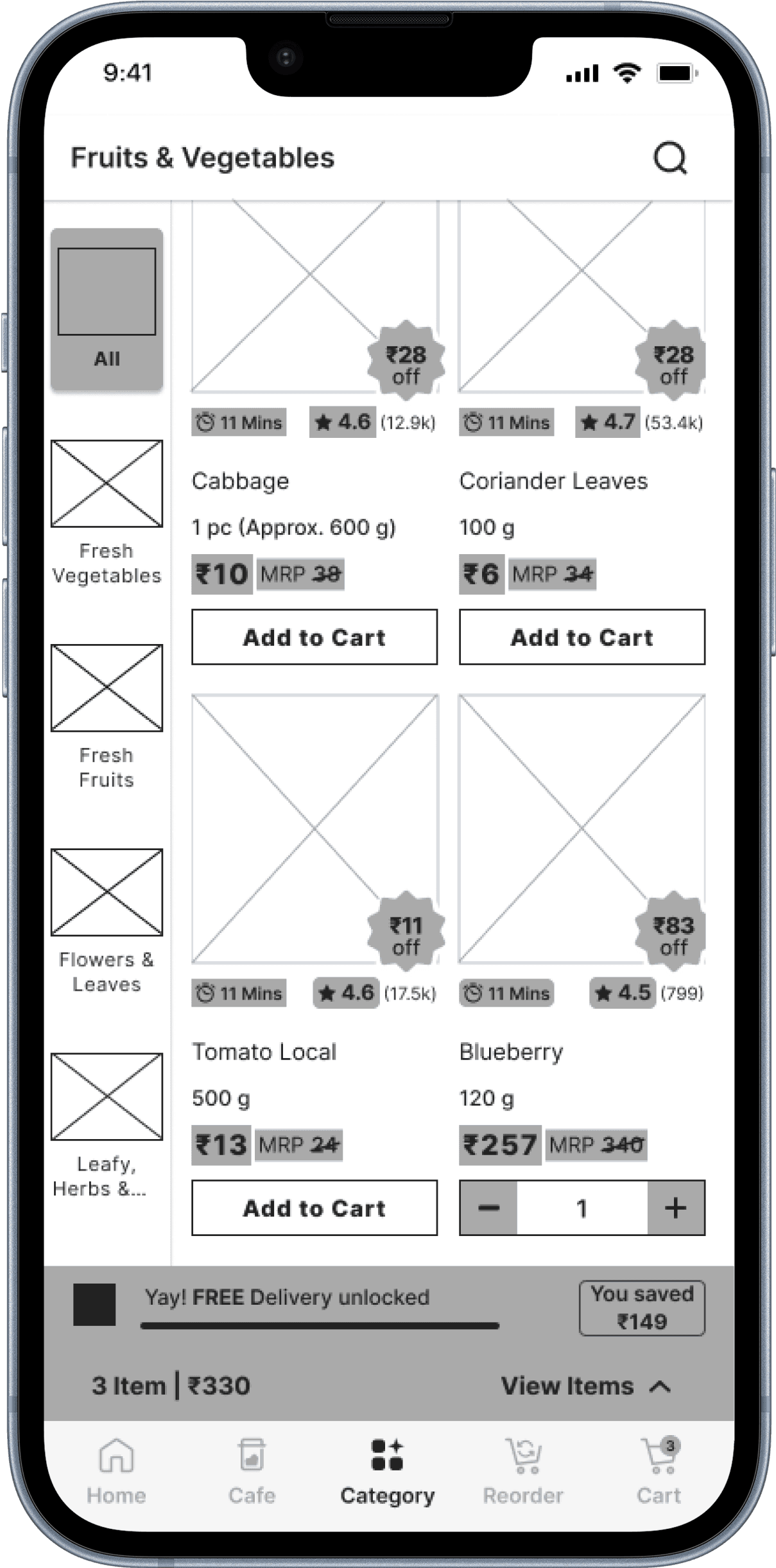
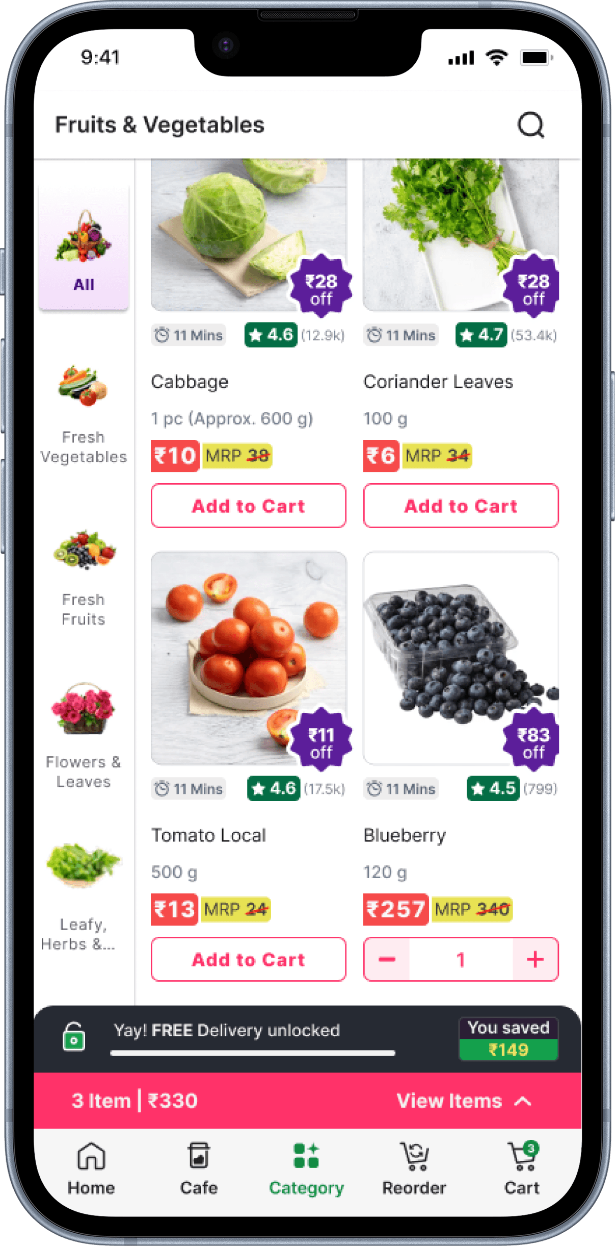
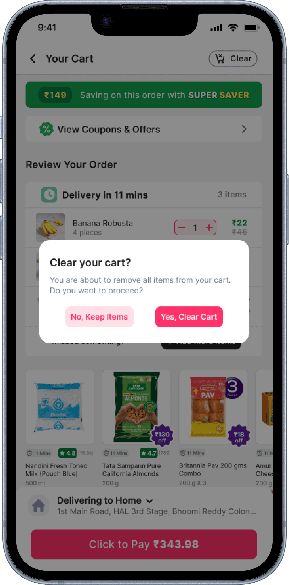
🔴 No option to clear all items in the cart at once, making it tedious to remove products manually.
Goals
✅ Add a Quick Reorder button for seamless repeat purchases.
✅ Improve cart visibility with a "View Items" option before checkout.
✅ Display a transparent bill summary with Free Cash usability.
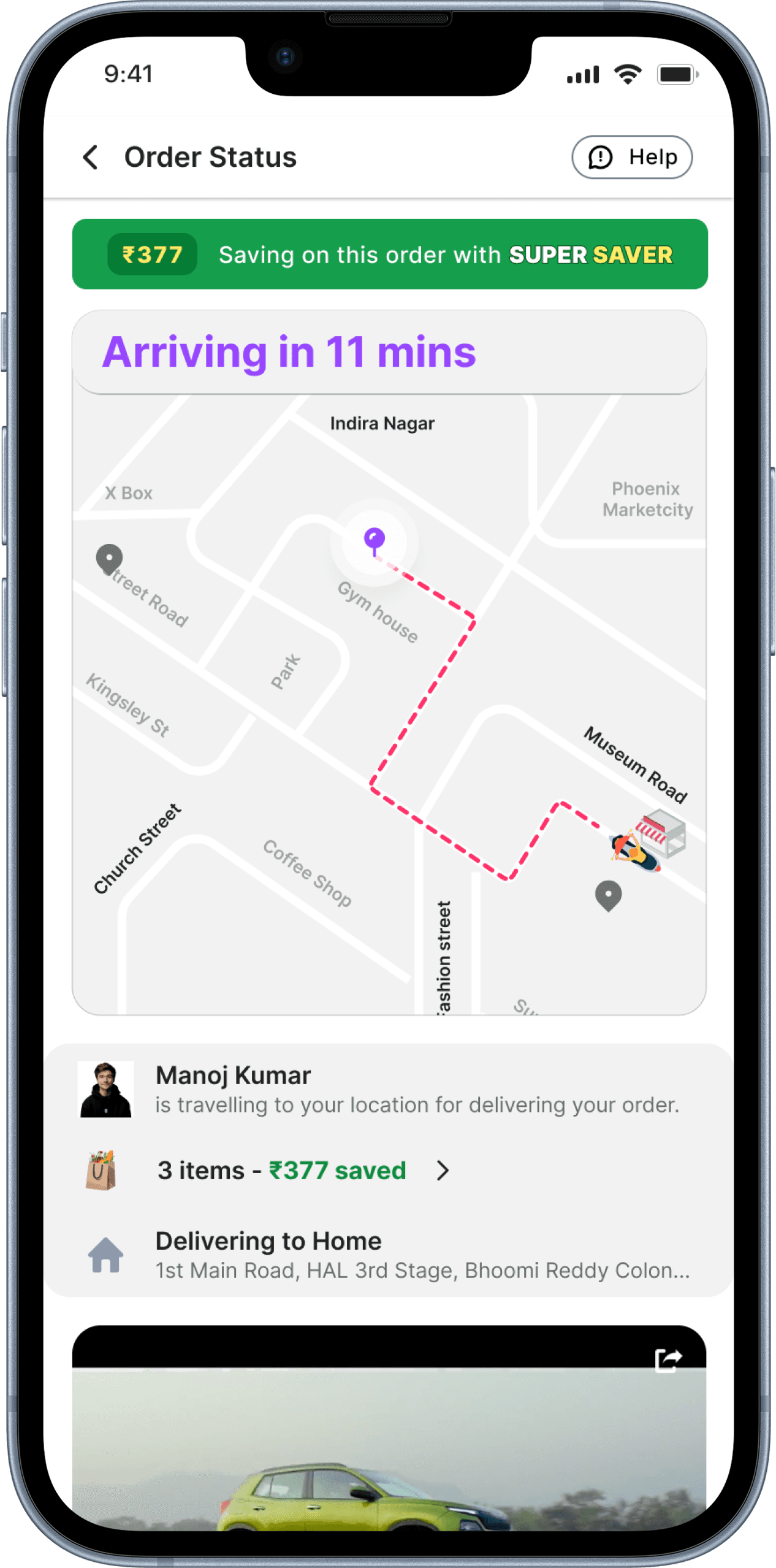
✅ Implement live tracking for real-time order updates.
✅ Introduce a Clear Cart button for effortless removal of all items at once.
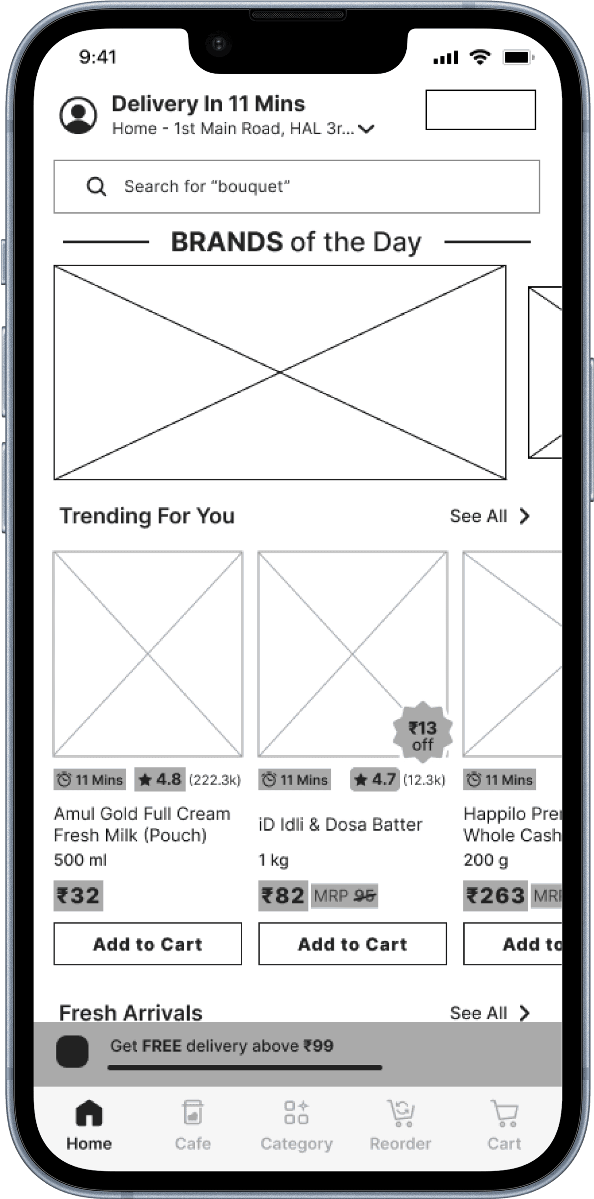
Wireframes

Mockups


Testing and Results
85% of testers preferred the new UI.
80% found live tracking highly beneficial.
40% faster reordering with Quick Reorder.
30% fewer cart abandonments due to better visibility.
“Reordering is now super quick! Saves me time.”
“Love the live tracking! No more guessing where my order is.”
Key Learnings
User-Centric Design Drives Results.
Simplicity Enhances Usability.
Continuous Testing Leads to Refinements.
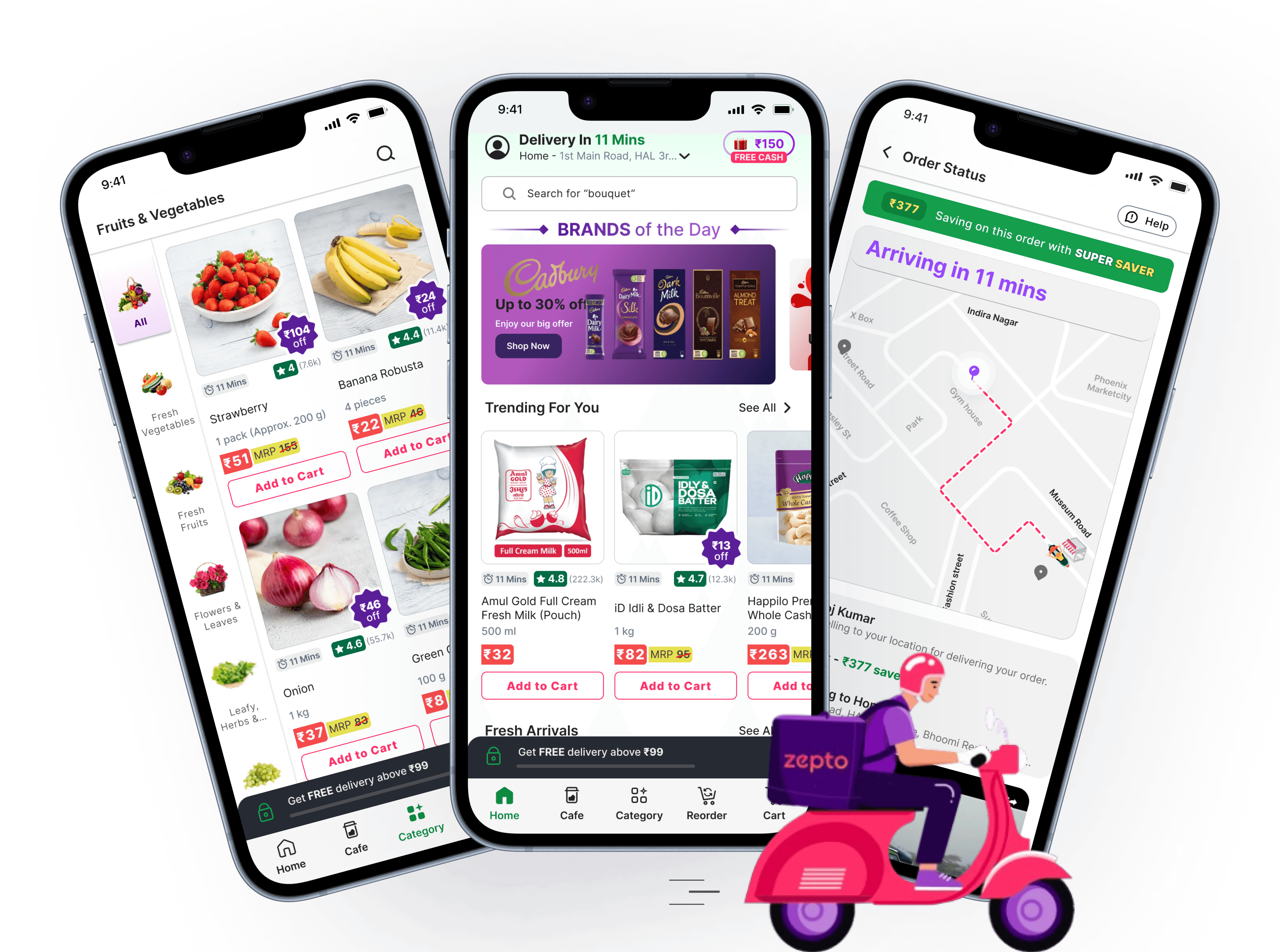
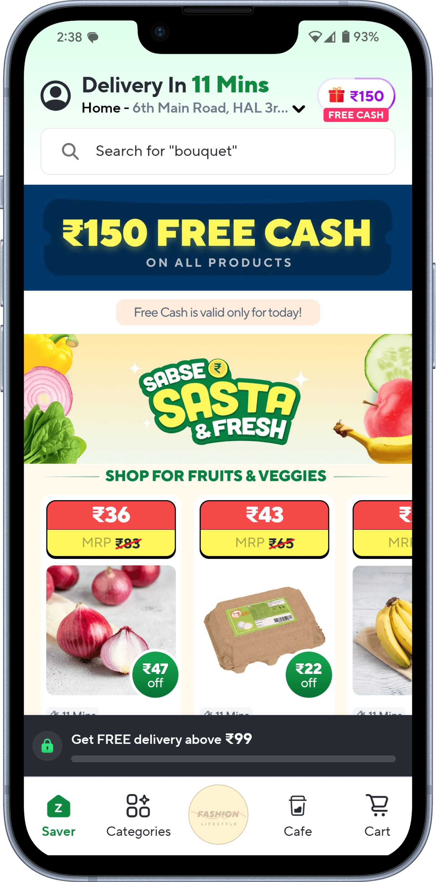
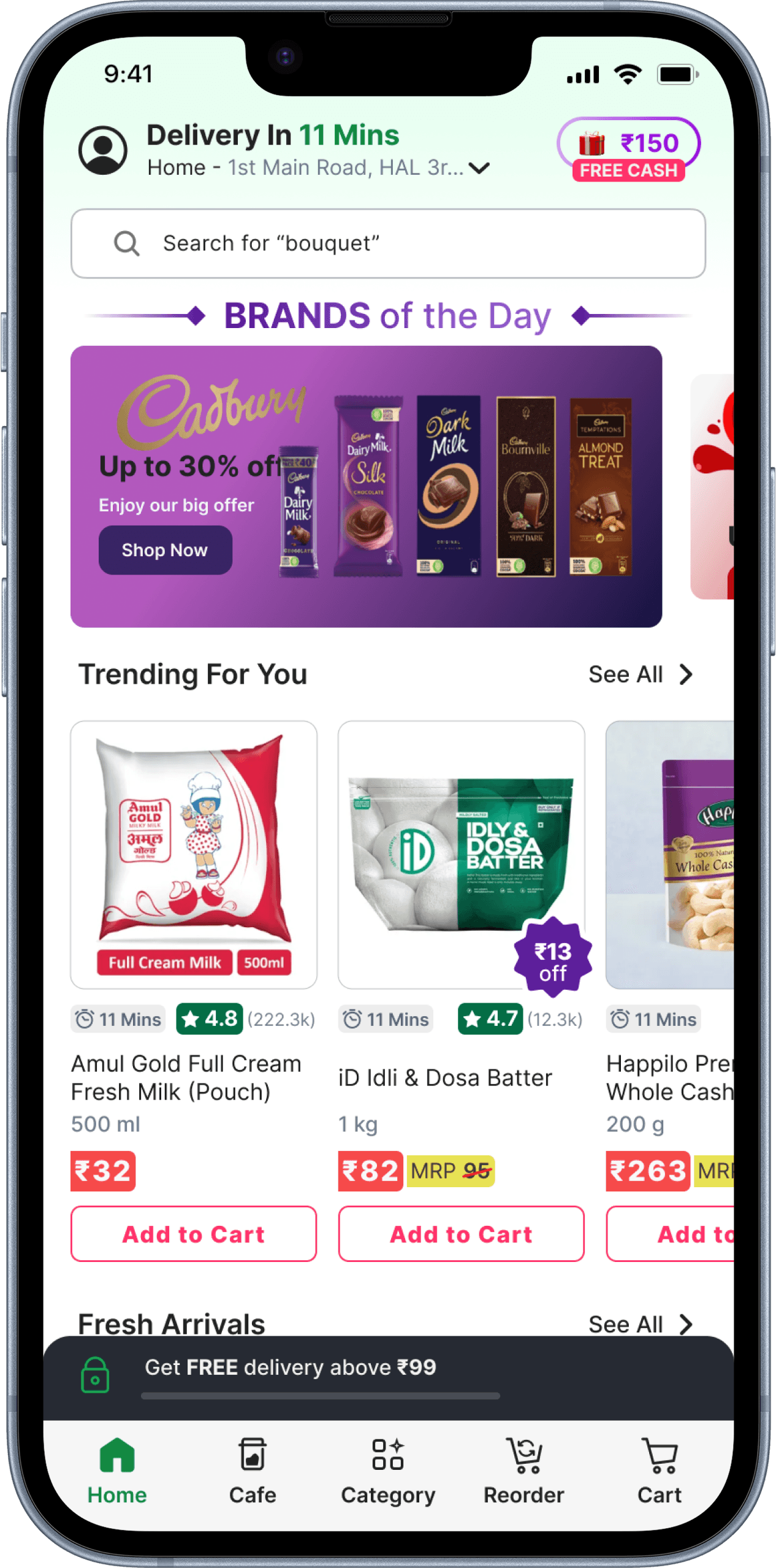
Home Screen
Before
After
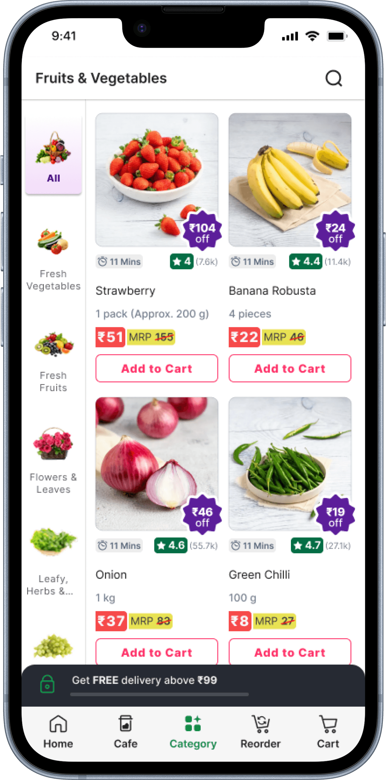
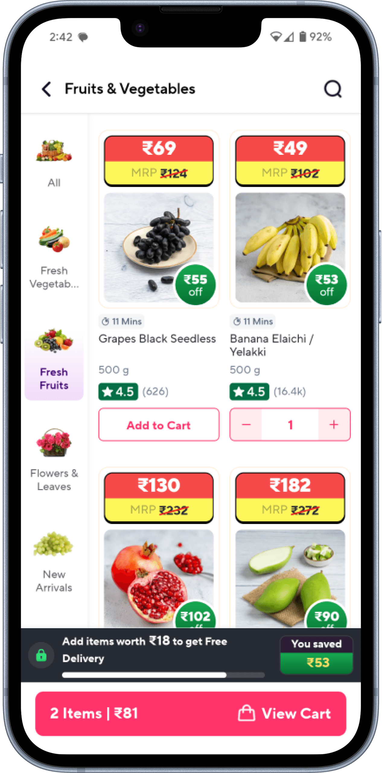
Category
Before

After
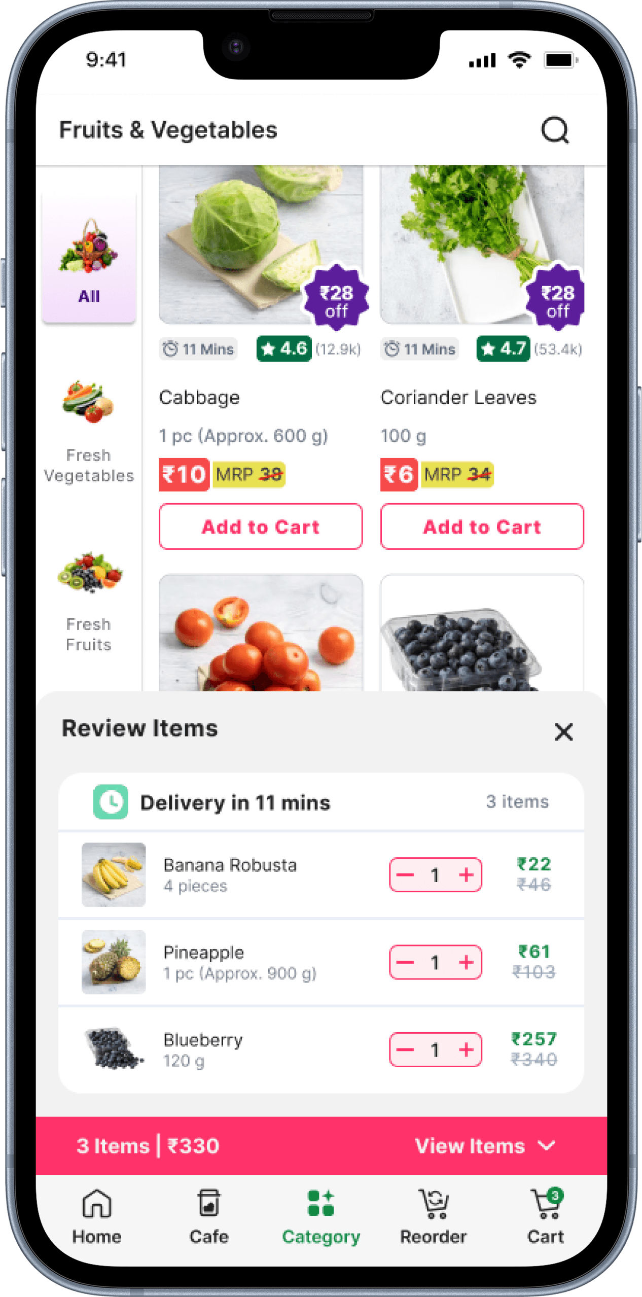
View Items
Before
After
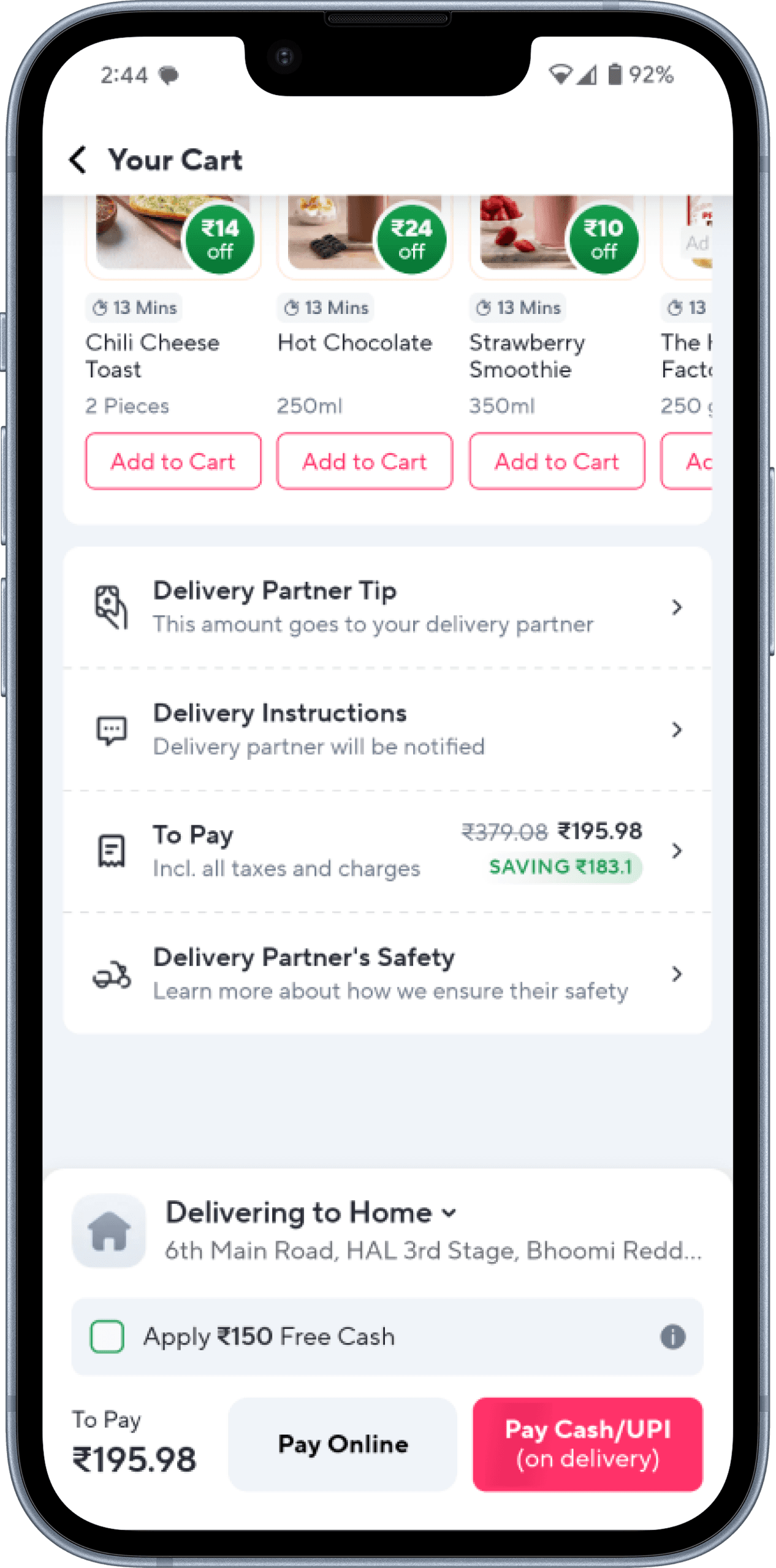
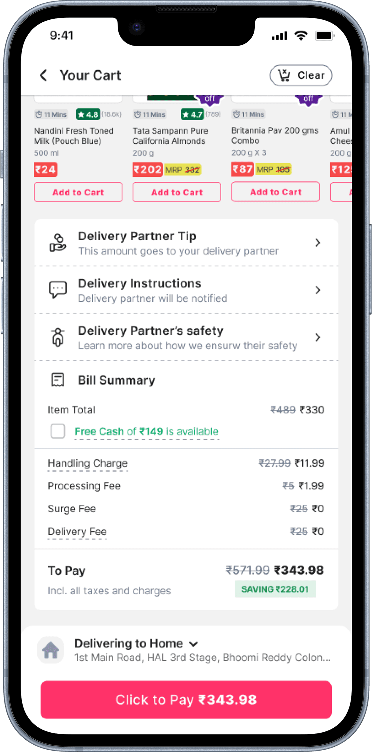
Bill Summary
Before
After
Order Tracking
Before
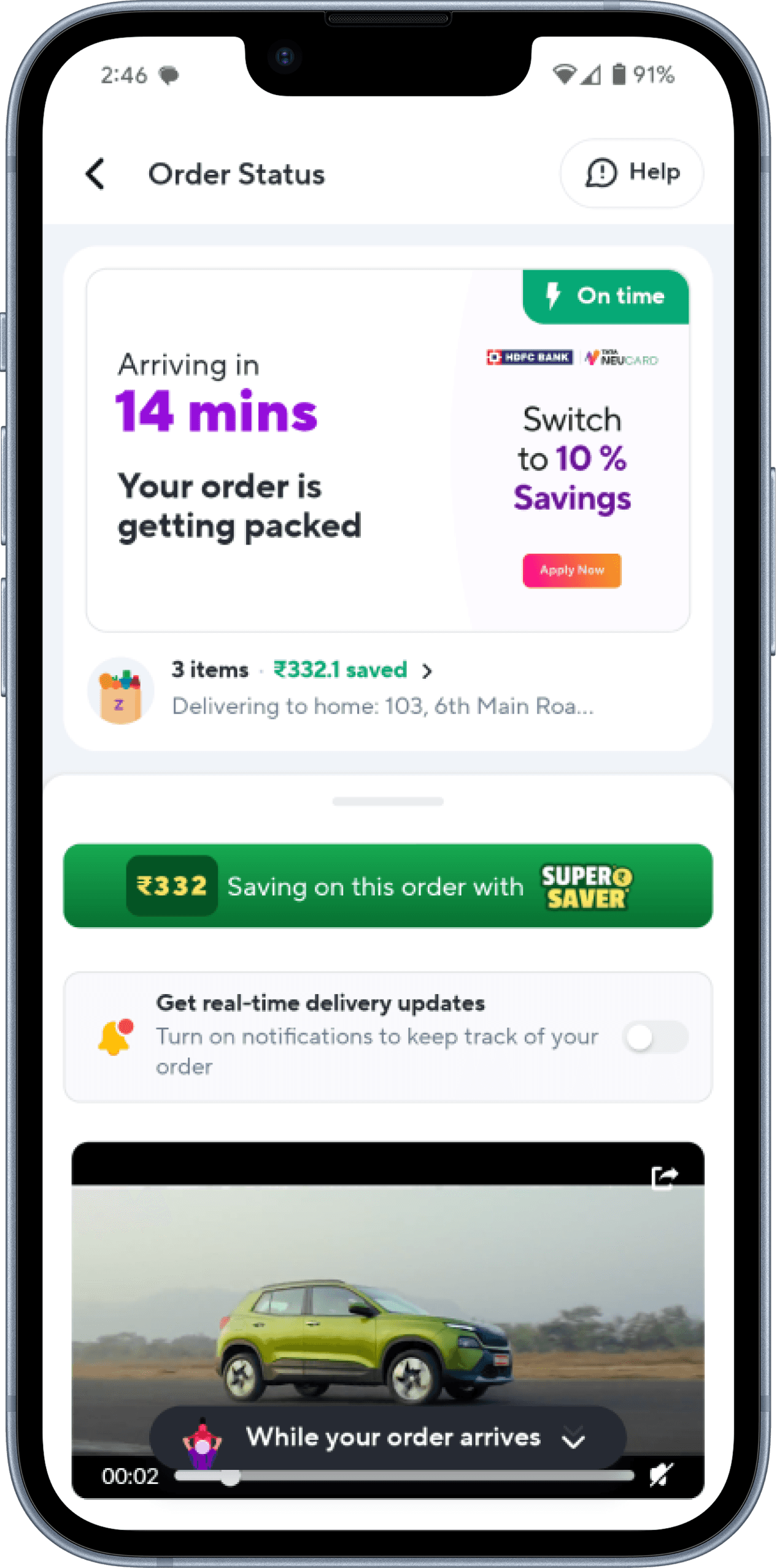
After